Final Project:


Blog 4:
We often hear the term “copyright” thrown around, which essentially is owning property. The definition from copyright.gov is, “Copyright is a form of protection grounded in the U.S. Constitution and granted by law for original works of authorship fixed in a tangible medium of expression. Copyright covers both published and unpublished works.” It is important to understand your own rights, as well as everyone else’s to keep yourself out of trouble. However, things can sometimes get complicated fairly quickly.
An article from BBC News discusses how “social media has thrown the norms of copyright law into chaos.” The debate is that celebrities are getting sued over images of themselves taken by paparazzi. You would think that since you are the subject of the photo you would be able to use it freely, right? Well, not exactly. According to copyright law, whoever has taken the image owns the rights to it. The only exception is if it’s been licensed through a third party, such as an agency in the example of celebrities. “In recent lawsuits, photograph agencies have claimed that it’s not fair for celebrities to reproduce and distribute their images to their millions of fans without license. Some have even appealed for compensation for loss of earnings,” (BBC News). What continues to make this debate more complicated is that paparazzi may license their photos “exclusively” to a news company. Celebrities earn money from several of their posts on platforms such as Instagram, so the argument is that the photographer is losing money and is infringing on their copyright. With the way social media is today, images can spread so rapidly that it becomes impossible to control.
From an ethical standpoint, I can completely understand why a celebrity would feel that they should have rights to these photos of themselves. They technically aren’t asking for these photos to be taken and their privacy is often invaded by swarms of paparazzi harassing them. One can argue their “rights to publicity” – conditions within some states’ laws which protect a person’s right to control how their name or likeness is used commercially.” In accordance with these rights and my own personal opinion, I would argue that this should cover celebrities and their ability to post these pictures taken of themselves. What continues to make this complicated is that it’s only in some states.
However, from a technical and legal standpoint “ethics” don’t matter. Whoever presses the button to snap the photo has ownership of the photograph. Paparazzi can sue celebrities for loss of earnings because a celebrities distribution is so much larger than anything agencies would be able to achieve.
References:

Blog 3:
When reading about the difference in layout between print and web I never realized how much thought and detail went into how to make them the most visually appealing for each platform. Even down to the details of what font looks best, was surprising to me. I decided to compare the cover of a National Geographic magazine to the website cover for this magazine issue. Starting with the magazine cover, there is a nice bold yellow border around the entire cover that essentially frames it. The background picture was clearly the focal point and immediately caught my attention. It was a man wearing a red shirt, climbing a rock. All of the text on the cover was white, except for a couple small accents of red that complimented the man’s shirt. There was a clear hierarchy by the way the text was laid out and what was most important. What I found interesting was that there were a few different fonts, rather than the suggested “two.” However, the title of “National Geographic” is a nice old style font, which is perfect for print and headlines because it’s very readable. The other set of font was a Sans Serif font, which again, is very effective for print. Most of the text was centered on the page, except for the title of the main article and the short description underneath it. In regards to the online version, it was much different. A different picture of the man standing on the rock is the background for the cover on the website and it fills almost the entire screen. It fades into black and that is where the issue, title, and description is typed. All of the font on this page is a Sans Serif, the title bolded, and the rest of the copy regular. Underneath is a preview of a couple other stories included in this issue and the pictures that go along with them follow the “grid of equal squares” layout. The way the image is formatted in both versions, the text does not get interrupted. I think both of these covers are effective, however, the magazine cover catches my attention much more. The yellow border combined with the focal point of the man climbing in the red shirt immediately draws my eye in.
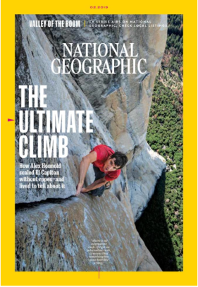
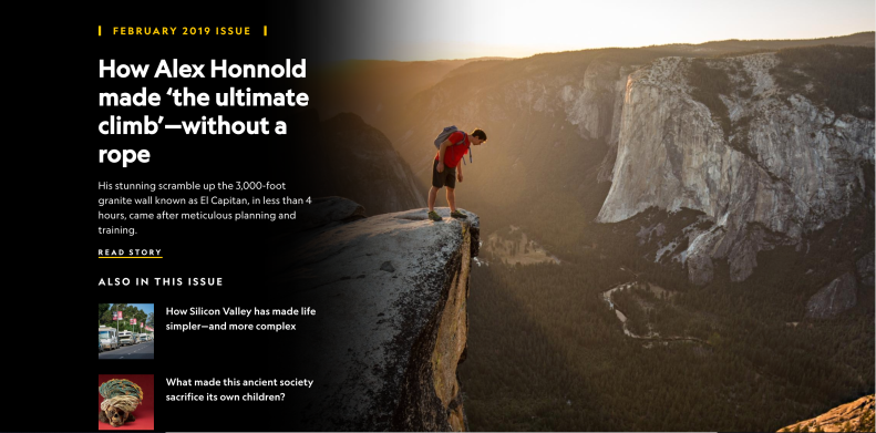
Magazine cover Online Cover
References:
Hagen, R., & Golombisky, K. (2017). White space is not your enemy: A beginners guide to communicating visually through graphic, web & multimedia design. Boca Raton: CRC Press, Taylor & Francis Group, CRC Press is an imprint of the Taylor & Francis Group, an informa business.
Blog 2:
When looking at art it’s easy to say whether you like it or not, but can you answer what the reason is behind that? Perception and sensation are key, perception is our way of making contact with our environment. Perception’s role is to make sense of sensations. There are six principles of good design that make art appealing and effective. These include focal point/emphasis, contrast, balance, movement, rhythm/pattern, and unity. The way in which someone chooses to use these principles is what creates good art. For example, the use of lines creates a perspective and a sense of movement. You can control how the viewer sees the image and how their eye moves throughout the piece. The size of elements are also used to speak to the viewer, larger elements are loud, while smaller elements are soft. There are different principles that are guaranteed to work to provide emphasis and a focal point, including the golden proportion and the rule of thirds.
Color is also another key element when it comes to design and art. Color creates visual impact, organizes, and evokes emotion. Pairing complementary colors together provides “the basis for harmonious color palettes,” (119). It’s important to consider the audience when it comes to color. Designing colors for readability and visibility is also very important. If there is light text on a light background or the opposite, it will make it hard to read and unappealing. Whitespace should also not be scary, it is actually necessary. It makes things feeling lighter and when it comes to designing things with type (i.e. a newsletter, online blog, etc.) it makes it much easier to read. Extensive whitespace can be used for a feeling of sophistication, elegance, and luxury.
Depth perception cues are also used and have a drastic effect on the way we perceive pieces of art. Texture gradient, superposition, vertical position, shadowing, aerial perspective, and linear perspective are all cues.
There are so many different elements that go into making something interesting to look at. But actually understanding how and why provides more value. Not only will you be able to pick something apart and understand why it’s good or bad, but you’ll be able to perfect your own work.
References:
Hagen, R., & Golombisky, K. (2017). White space is not your enemy: A beginners guide to communicating visually through graphic, web & multimedia design. Boca Raton: CRC Press, Taylor & Francis Group, CRC Press is an imprint of the Taylor & Francis Group, an informa business.
Blog 1:
Information is “Data that is (1) accurate and timely, (2) specific and organized for a purpose, (3) presented within a context that gives it meaning and relevance, and (4) can lead to an increase in understanding and decrease in uncertainty,” (businessdictionary.com). It affects our everyday lives including our behavior and decisions. Information continues to grow in both scale and complexity. Something that we may often forget is that without interaction there is no information, it needs context. They way gather information today has changed drastically due to technology. Recently I’ve been learning new information about design. Just like information continues to grow, the evolution of graphic design has drastically changed throughout the years as a response to the needs of revolution. In relation to design, comes a new term to me, called “form follows function.” This term is associated with design and the idea that the shape of a building or object should relate to it’s intended function. One of the most historical representations of this term is the Guggenheim Museum because it’s spiral shape was designed to allow visitors to be able to view the artwork within the building easily. The term is applied to so many different inventions including something as “simple” as a clock. However, this term doesn’t only pertain to buildings and objects, but also web design. When designing a website, “the designer should first gather the website’s requirements from the client and then determine the aesthetics of the website based on those functional requirements,” (Bradley, 2010).
On the other hand, it’s also important to keep in mind that function can also follow form. Both function and form can help guide the design, but success criteria will help to determine the functionality that’s needed and the form it should take. Form and function need to have a cohesive balance when function dominates it becomes boring. When it comes to the development process, it’s ideal that, “usability and aesthetics has been treated with the same importance, so that the best result can be achieved for the user. This is also the basis and philosophy for our daily work as professional user interface designers and usability engineers,” (Burghart, 2012).
Web design trends are also continually changing. There’s always a delicate balance between following what’s trending and feeling that in order to be creative you should be doing the opposite. “What matters is understanding the hows and whys of trends’ emergence and adoption. Because at the end of the day, trends have a lot to tell us about our cultural moment: what we love, what we hate, what we want to move toward,” (Williams, 2018). These trends create history, and this history is information. It all seamlessly ties together.
References:
Retrieved 01/24, 2018, from http://www.businessdictionary.com/definition/information.html
Bradley, S. (2010). Does form follows function? Retrieved 01/24, 2018, from https://www.smashingmagazine.com/2010/03/does-form-follow-function/
Burghart, A. (2012). “Form follows function” – an unclear design principle. Retrieved 01/24, 2018, from https://www.centigrade.de/blog/en/article/form-follows-function-an-unclear-design-principle/
Williams, J. (2018). 20 web design trends for 2019. Retrieved 01/24, 2018, from https://webflow.com/blog/20-web-design-trends-for-2019
